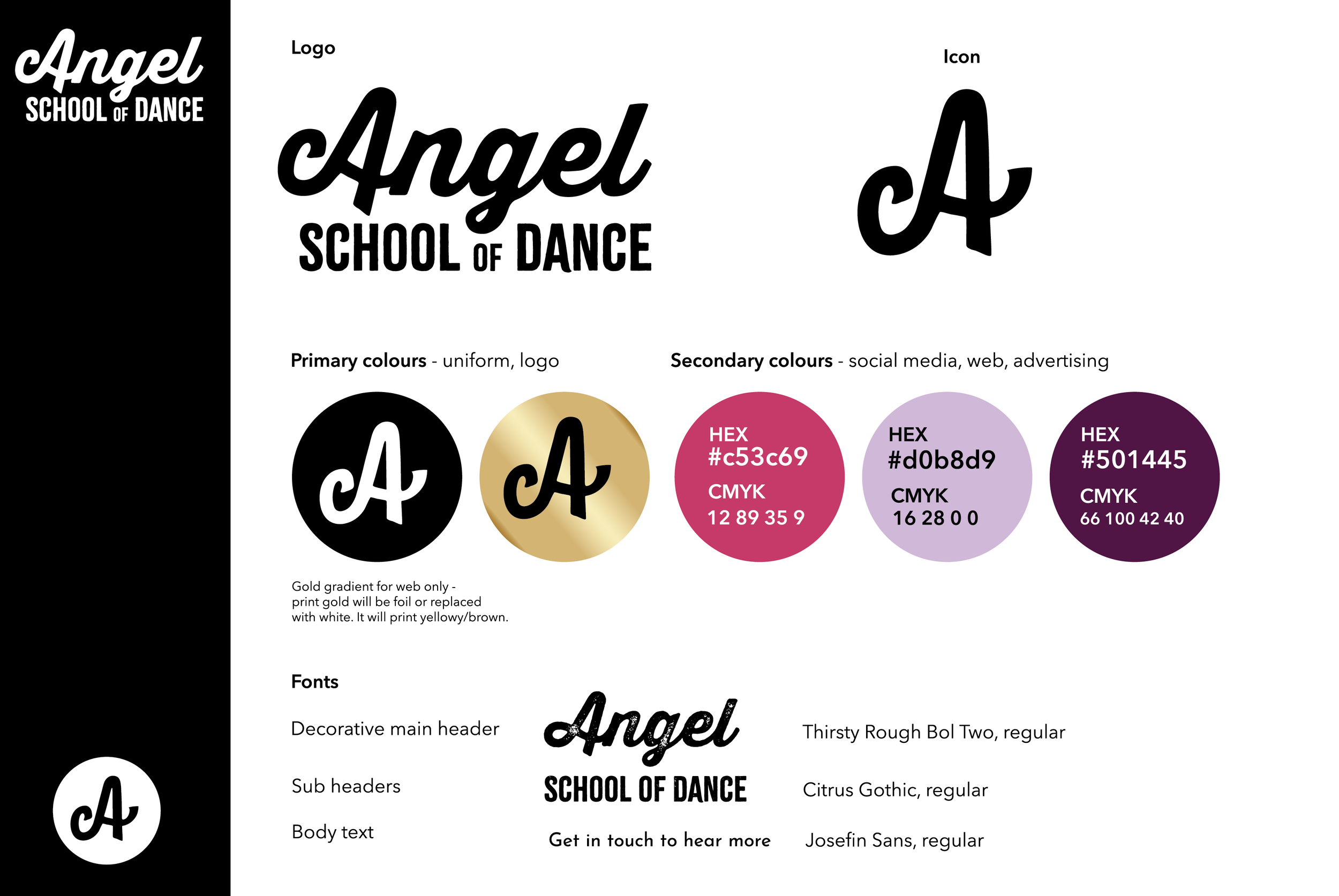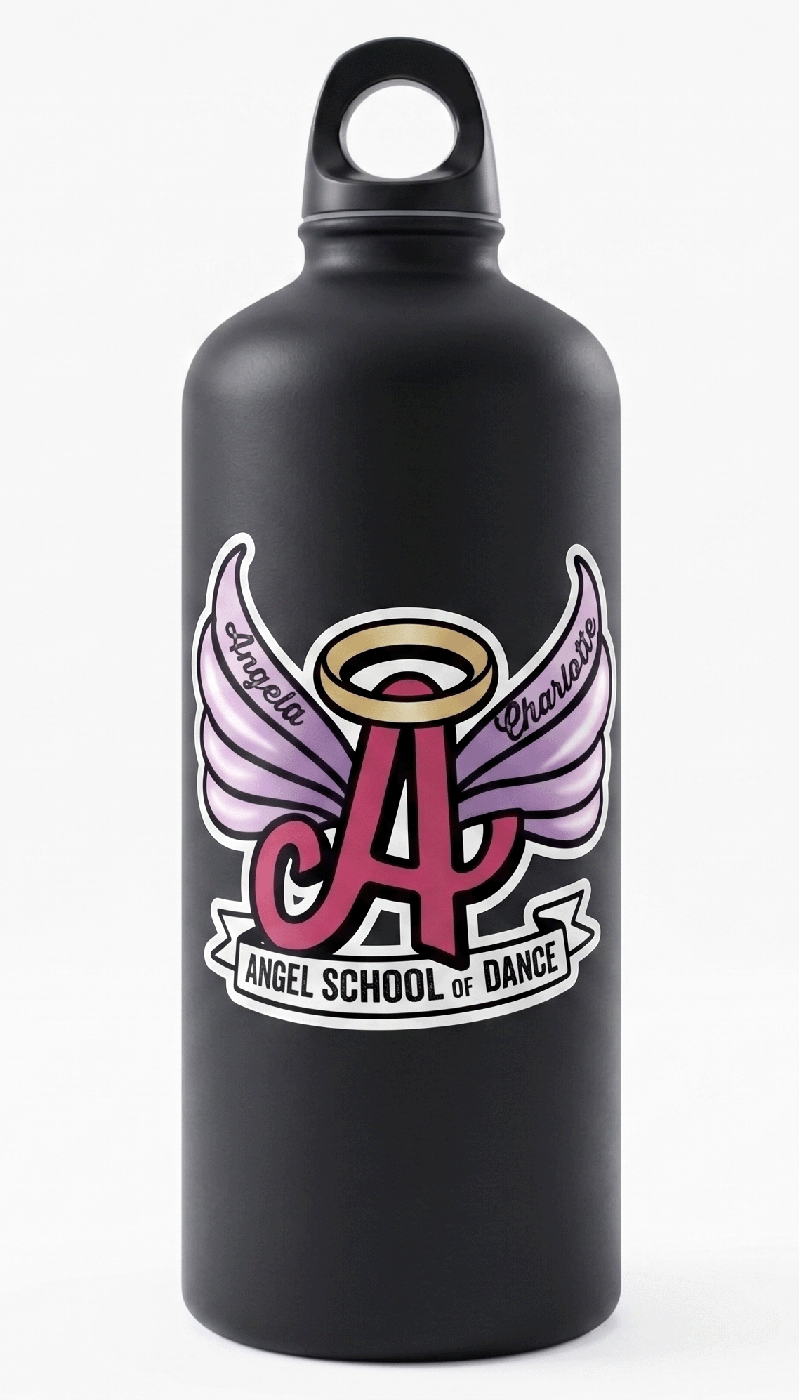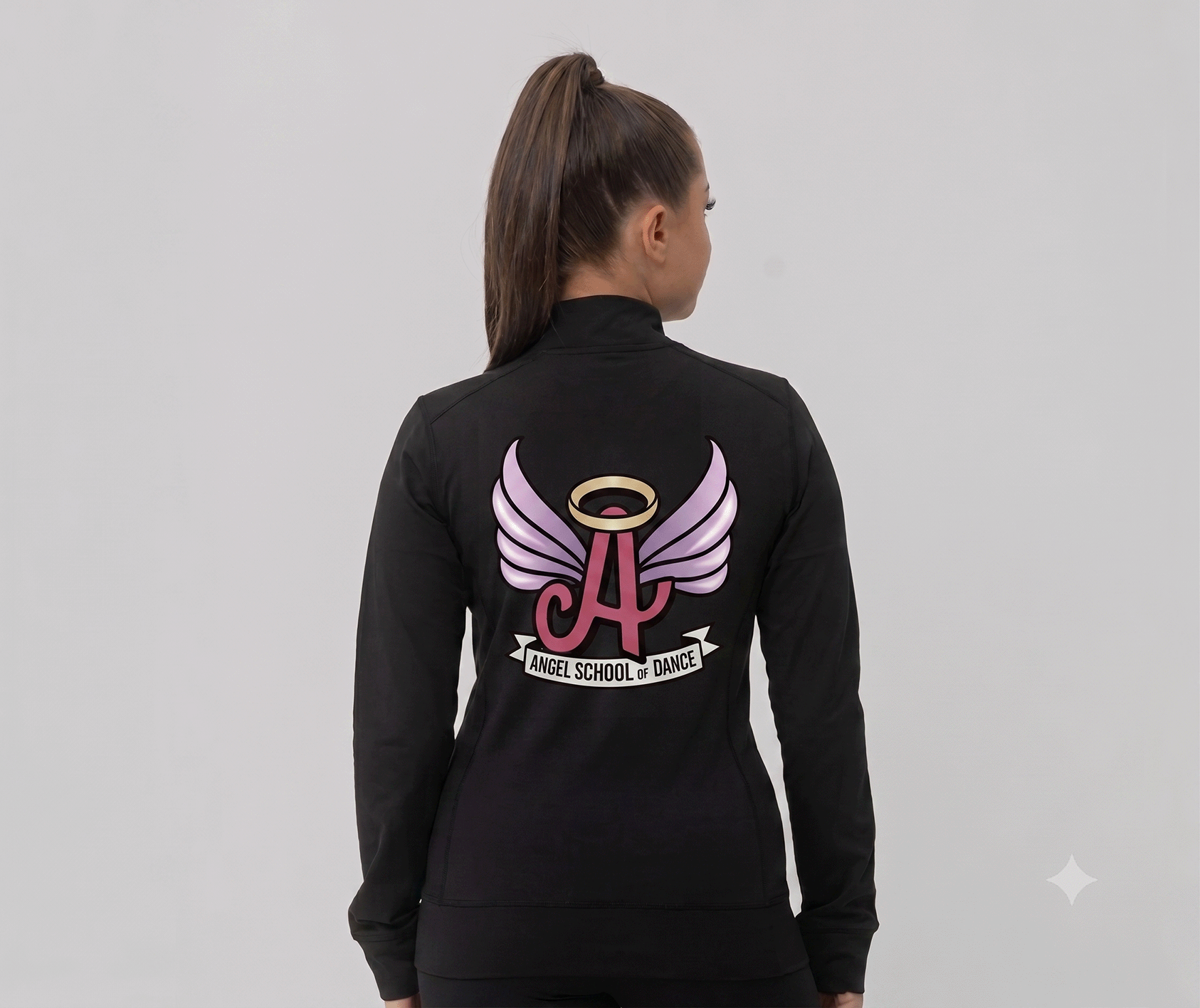
Rebrand for the Angel School of Dance. In recent years they’ve expanded their offering from the more traditional ballet / tap / musical theatre to include commercial, street, acro and lyrical. New brand to reflect the change and to be applicable to a wider style of dance.

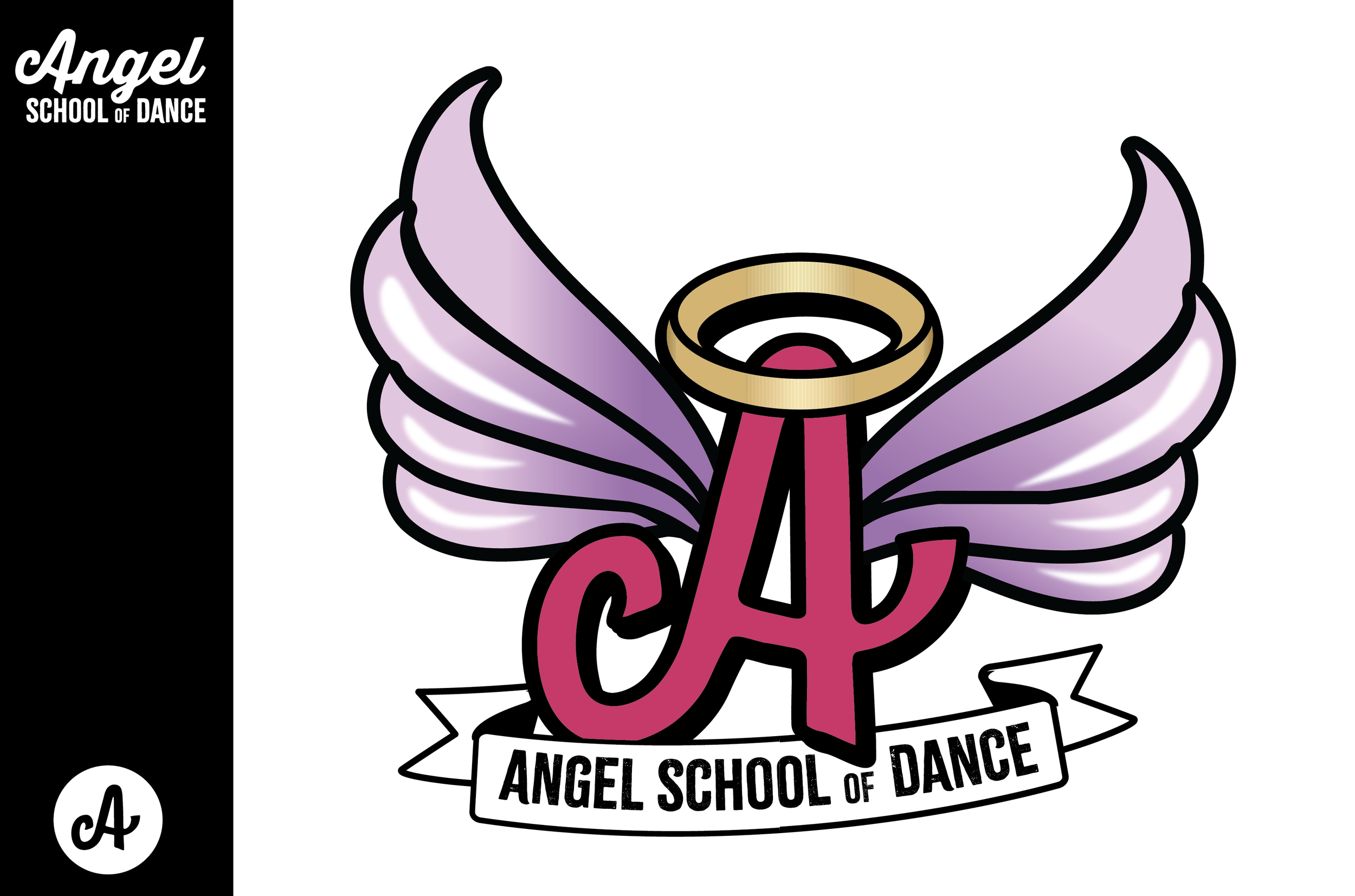
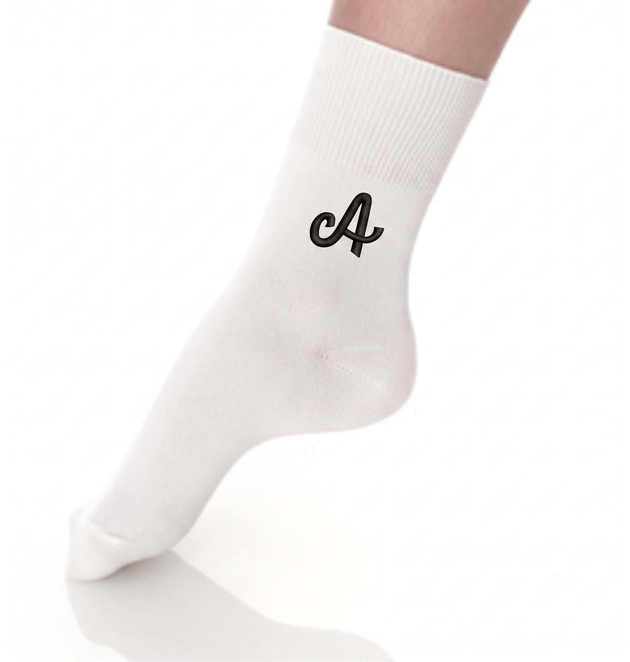
Icon used as a subtle nod to the Principal coaches, Angela and Charlotte. Angela formed the school in 1979 and Charlotte attended and then joined as a fellow teacher. The ‘A’ for Angel and Angela as the founding base, using a swash flourish to incorporate ‘C’ for Charlotte.
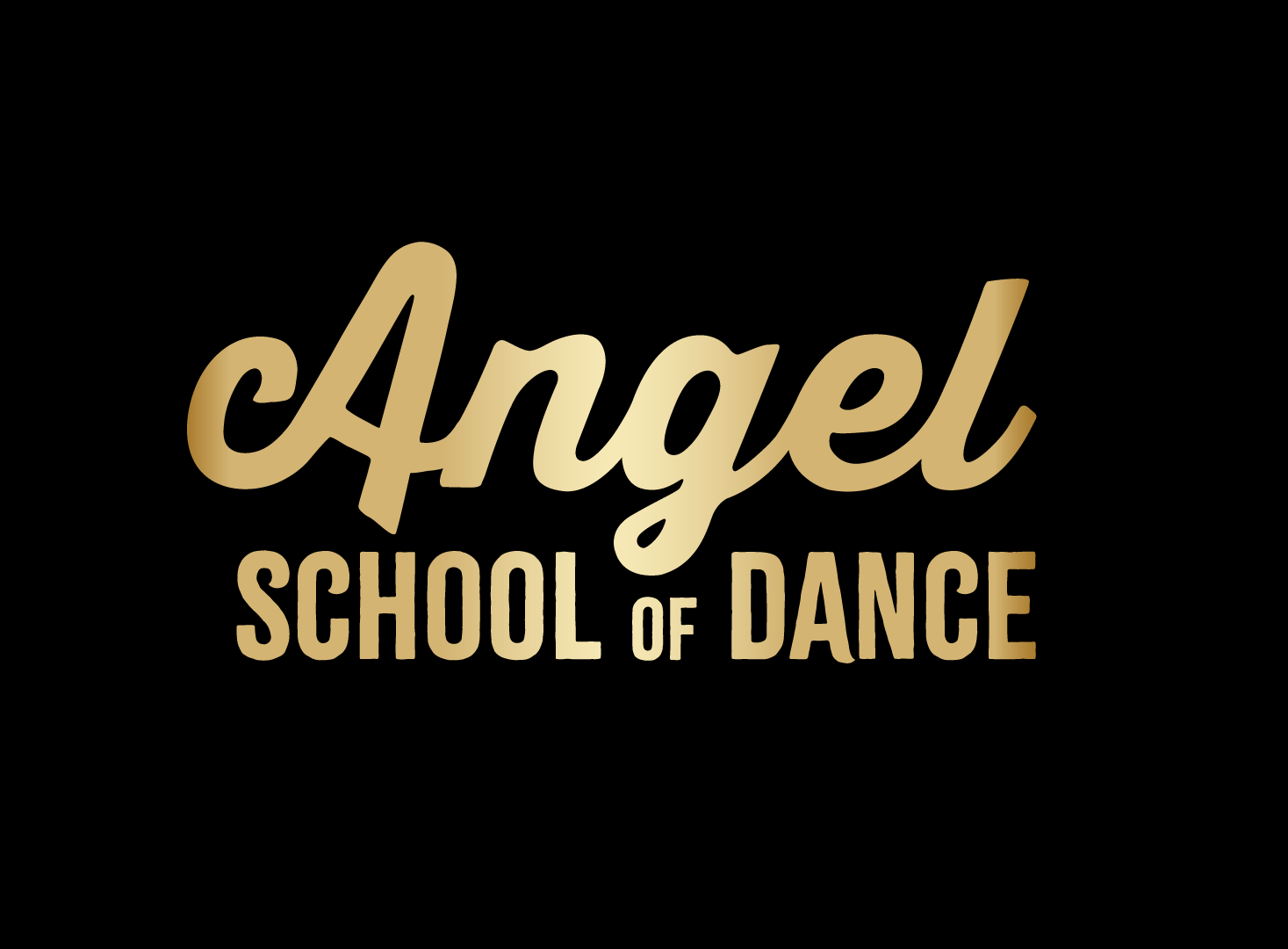
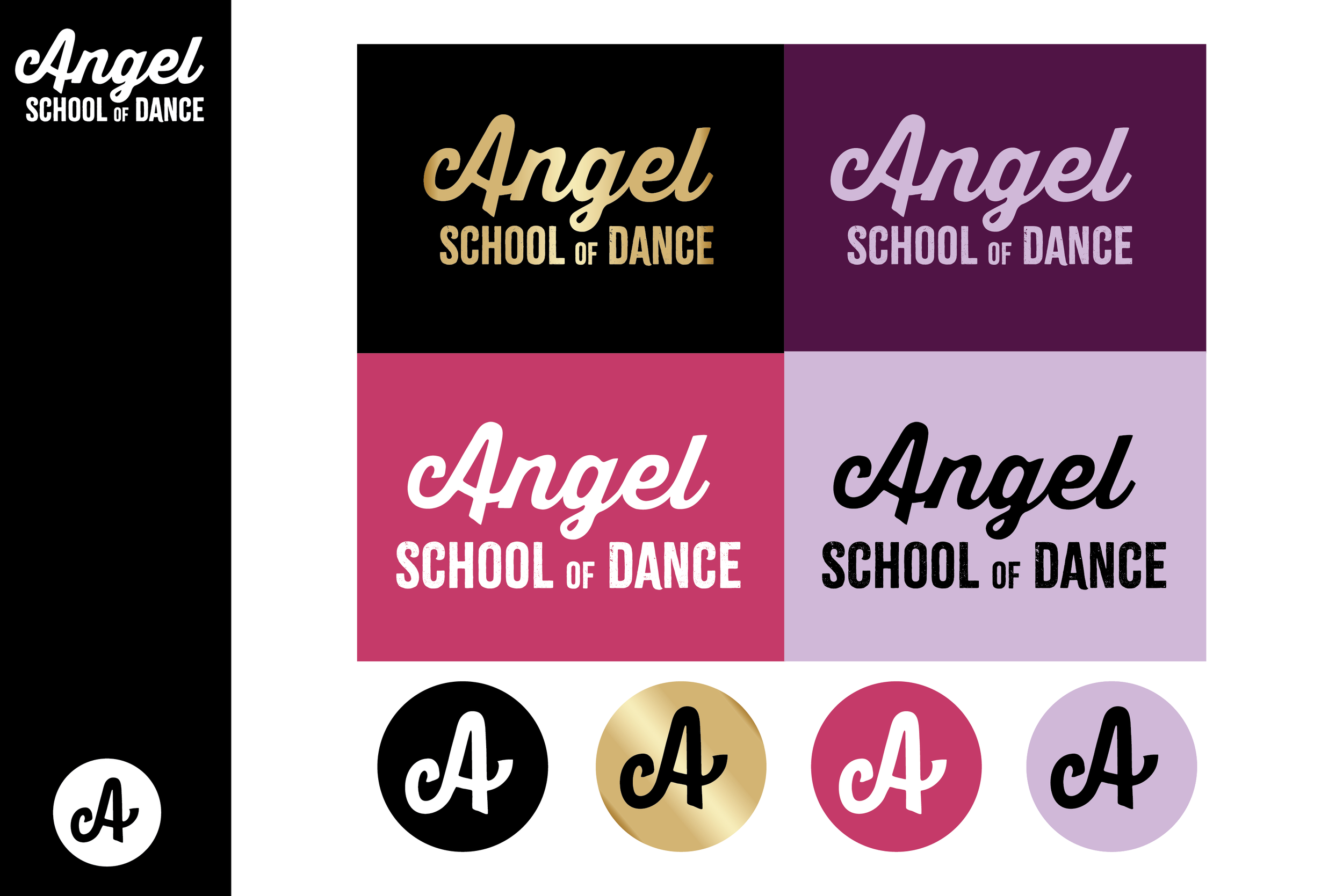
The school’s preferred colour way - gold on black. Used where legibility allows, with gold foil / embroidery used in print.
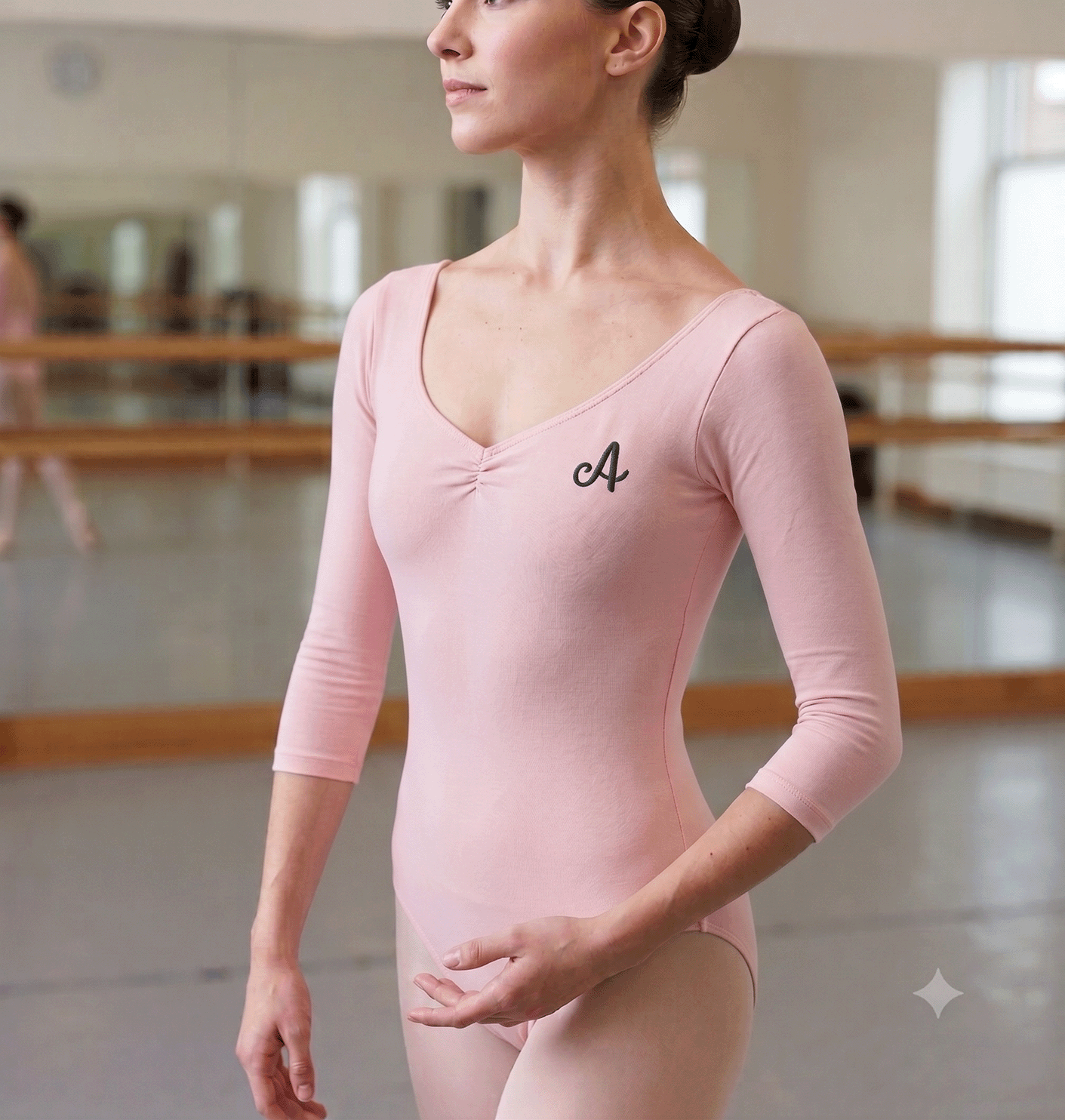
The icon used
for the more traditional styling and where strict uniform is necessary.
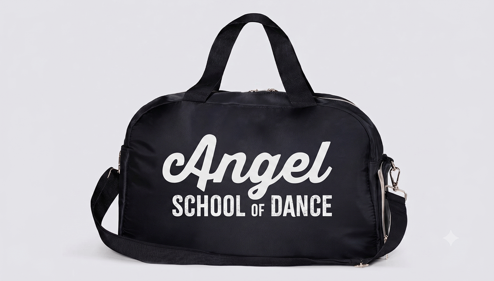
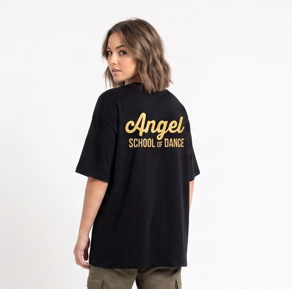
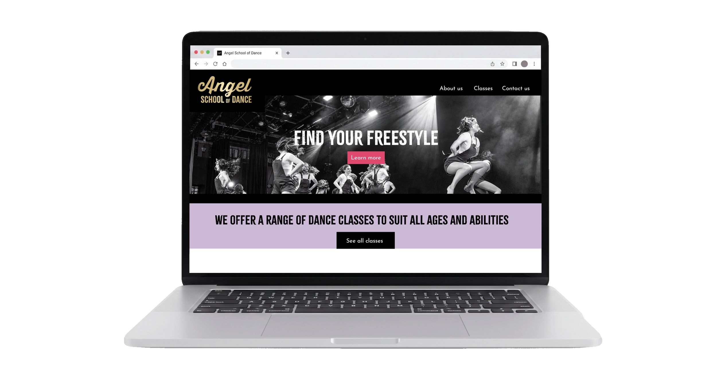
Full logo in use for the school across the more modern styling.